Reordering a Qt Quick ListView via drag'n'drop - part 3
written on Sunday, May 8, 2016
This is the third article in the "Reordering a Qt Quick ListView via drag'n'drop" series. If you haven't read them already, here are the first and second articles.
In this final article we are going to show a rectangle at the place where the dragged item is going to be dropped. This gives the user a better understanding of what is going to happen.
Here is what it looks like:

Placeholders are going to be Rectangles with an height of 0 by default. When an item is dragged over them, they will take the height of the dragged item.
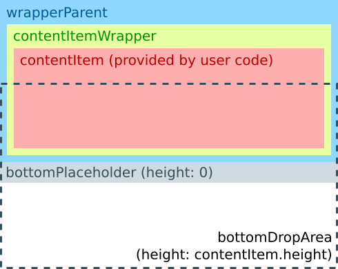
To achieve this we need to refactor our code a bit. DraggableItem wraps the list item in contentItemWrapper, which is a direct child of DraggableItem, but is reparented to draggableItemParent when dragged. To implement placeholders, this won't be enough: if we anchor the placeholder rectangles to contentItemWrapper all sort of weird layout issues happen when contentItemWrapper is reparented. To avoid this we are going to "wrap the wrapper", by introducing an item which holds contentItemWrapper but is never reparented. I had a hard time finding an understandable id for this item, I came up with wrapperParent, which is a bit lame, bear with me (I initially used contentItemWrapperParent, but it was both lame and long).
The new structure of a DraggableItem looks like this:
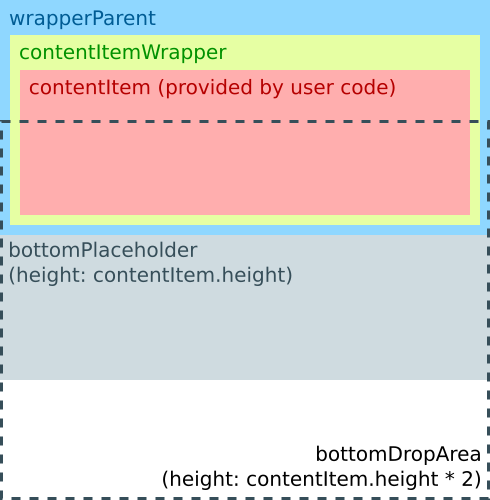
When a dragged item enters the DropArea, the DraggableItem changes to this:
This time I am providing an abbreviated version of the whole source instead of describing the changes because the changes in this article are not easy to describe progressively. Hopefully the structure diagrams gives you a higher-level view of how placeholders work.
Item {
    id: root
    // (...)
    width: contentItem.width
    height: topPlaceholder.height + wrapperParent.height + bottomPlaceholder.height
    // (...)
    Rectangle {
        id: topPlaceholder
        anchors {
            left: parent.left
            right: parent.right
            top: parent.top
        }
        height: 0
        color: "lightgrey"
    }
    Item {
        id: wrapperParent
        anchors {
            left: parent.left
            right: parent.right
            top: topPlaceholder.bottom
        }
        height: contentItem.height
        Rectangle {
            id: contentItemWrapper
            anchors.fill: parent
            // (...)
        }
    }
    Rectangle {
        id: bottomPlaceholder
        anchors {
            left: parent.left
            right: parent.right
            top: wrapperParent.bottom
        }
        height: 0
        color: "lightgrey"
    }
    // (...)
    Loader {
        id: topDropAreaLoader
        active: model.index === 0
        anchors {
            left: parent.left
            right: parent.right
            bottom: wrapperParent.verticalCenter
        }
        height: contentItem.height
        sourceComponent: Component {
            DropArea {
                property int dropIndex: 0
            }
        }
    }
    DropArea {
        id: bottomDropArea
        anchors {
            left: parent.left
            right: parent.right
            top: wrapperParent.verticalCenter
        }
        property bool isLast: model.index === _listView.count - 1
        height: isLast ? _listView.contentHeight - y : contentItem.height
        property int dropIndex: model.index + 1
    }
    states: [
        State {
            when: dragArea.drag.active
            name: "dragging"
            ParentChange {
                target: contentItemWrapper
                parent: draggedItemParent
            }
            PropertyChanges {
                target: contentItemWrapper
                opacity: 0.9
                anchors.fill: undefined
                width: contentItem.width
                height: contentItem.height
            }
            PropertyChanges {
                target: wrapperParent
                height: 0
            }
            PropertyChanges {
                target: root
                _scrollingDirection: {
                    // (...)
                }
            }
        },
        State {
            when: bottomDropArea.containsDrag
            name: "droppingBelow"
            PropertyChanges {
                target: bottomPlaceholder
                height: contentItem.height
            }
            PropertyChanges {
                target: bottomDropArea
                height: contentItem.height * 2
            }
        },
        State {
            when: topDropAreaLoader.item.containsDrag
            name: "droppingAbove"
            PropertyChanges {
                target: topPlaceholder
                height: contentItem.height
            }
            PropertyChanges {
                target: topDropAreaLoader
                height: contentItem.height * 2
            }
        }
    ]
    // (...)
}
You may wonder why we are not using a Column or a ColumnLayout to hold the topPlaceholder, wrapperParent and bottomPlaceholder items together. The reason for this is that it makes it impossible to anchor DropAreas: an Item can only be anchored to a sibling or to a parent so if bottomPlaceholder were in a Column, bottomDropArea could not anchor to it.
Since we no longer need a drop indicator, or rather, since it is now implemented differently, I removed the DraggableItemDropArea component. The code now uses plain DropAreas with a custom dropIndex property.
There is one extra hack I added for completeness: when the list contains few elements, the gap between the last item and the bottom of the view can be taller than contentItem.height / 2, but the user expects the whole gap to work as a drop target. To implement this I added some special code to the bottomDropArea so that if it is the last item of the list, it sets its height to cover the whole gap. Unfortunately, there is no generic way to know if an item is the last one, so the hack relies on the model exposing a count property. This works out of the box for QML ListModel models, but you will have to add this property to your model if your model is based on a C++ QAbstractItemModel. Implementation boils down to returning the value of QAbstractItemModel::rowCount() so it's not that much work.
(Update: As Kai pointed out on G+, ListView actually has a count property which can be used for this)
The source code for this article is available in the associated GitHub repository, under the "3-placeholders" tag. You can view the changes between the version in this article and the previous one as a diff.
This article concludes this series on reordering a QML ListView via drag'n'drop. I hope you found it useful.