Reordering a Qt Quick ListView via drag'n'drop - part 1
written on Sunday, April 24, 2016
It is common in user interfaces to provide the user with a list of elements which can be reordered by dragging them around. Displaying a list of elements with Qt Quick is easy, thanks to the ListView component. Giving the user the ability to reorder them is less straightforward. This 3 article series presents one way to implement this.
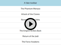
The goal of this first article is to create a list which can be used like this:
Architecture
The approach I used was to do all the work in a DraggableItem, leaving the ListView untouched. DraggableItem is used as the delegate of the ListView, and wraps the real QML item responsible for showing the details of the list element.
Lets start with main.qml. Nothing fancy at the beginning, we create a Window and a ListModel defining our elements:
import QtQuick 2.6
import QtQuick.Window 2.2
import QtQuick.Controls 1.4
import QtQuick.Layouts 1.1
Window {
    visible: true
    width: 500
    height: 400
    ListModel {
        id: myModel
        ListElement {
            text: "The Phantom Menace"
        }
        ListElement {
            text: "Attack of the Clones"
        }
        ListElement {
            text: "Revenge of the Siths"
        }
        ListElement {
            text: "A New Hope"
        }
        ListElement {
            text: "The Empire Strikes Back"
        }
        ListElement {
            text: "Return of the Jedi"
        }
        ListElement {
            text: "The Force Awakens"
        }
    }
Now comes the main Item. It contains a ColumnLayout which holds a Rectangle faking a toolbar and our ListView, wrapped in a ScrollView:
Item {
    id: mainContent
    anchors.fill: parent
    ColumnLayout {
        anchors.fill: parent
        spacing: 0
        Rectangle {
            color: "lightblue"
            height: 50
            Layout.fillWidth: true
            Text {
                anchors.centerIn: parent
                text: "A fake toolbar"
            }
        }
        ScrollView {
            Layout.fillWidth: true
            Layout.fillHeight: true
            ListView {
                id: listView
                model: myModel
                delegate: DraggableItem {
                    Rectangle {
                        height: textLabel.height * 2
                        width: listView.width
                        color: "white"
                        Text {
                            id: textLabel
                            anchors.centerIn: parent
                            text: model.text
                        }
                        // Bottom line border
                        Rectangle {
                            anchors {
                                left: parent.left
                                right: parent.right
                                bottom: parent.bottom
                            }
                            height: 1
                            color: "lightgrey"
                        }
                    }
                    draggedItemParent: mainContent
                    onMoveItemRequested: {
                        myModel.move(from, to, 1);
                    }
                }
            }
        }
We can see DraggableItem used as a delegate of the ListView. Its API is simple: it wraps another item which shows the content (here it is a rectangle with a text and a one-pixel border at the bottom).
DraggableItem has one property: draggedItemParent, which defines which item becomes the parent of our content item while it is being dragged around. Setting this to the main content of your window gives a more natural feeling when you drag the item below or above the ListView: the item is not clipped to its view and appears on top of the other UI elements.
It also has a signal: moveItemRequested, which is emitted when the user dragged an item from one place to another. In this example we use ListModel.move to react to this but if you use a custom model you could call any other method.
DraggableItem implementation
DraggableItem contains a contentItemWrapper item, which is the parent of the DraggableItem child. When we start dragging, contentItemWrapper is reparented to the item specified in the draggedItemParent property of DraggableItem.
This is the beginning of DraggableItem.qml, it shows how contentItem is wrapped inside contentItemWrapper:
import QtQuick 2.0
Item {
    id: root
    default property Item contentItem
    // This item will become the parent of the dragged item during the drag operation
    property Item draggedItemParent
    signal moveItemRequested(int from, int to)
    width: contentItem.width
    height: contentItem.height
    // Make contentItem a child of contentItemWrapper
    onContentItemChanged: {
        contentItem.parent = contentItemWrapper;
    }
    Rectangle {
        id: contentItemWrapper
        anchors.fill: parent
Lets finish the definition of contentItemWrapper and continue with the code necessary to start the drag:
//
        Drag.active: dragArea.drag.active
        Drag.hotSpot {
            x: contentItem.width / 2
            y: contentItem.height / 2
        }
        MouseArea {
            id: dragArea
            anchors.fill: parent
            drag.target: parent
            // Keep the dragged item at the same X position. Nice for lists, but not mandatory
            drag.axis: Drag.YAxis
            // Disable smoothed so that the Item pixel from where we started the drag remains
            // under the mouse cursor
            drag.smoothed: false
            onReleased: {
                if (drag.active) {
                    emitMoveItemRequested();
                }
            }
        }
    }
    states: [
        State {
            when: dragArea.drag.active
            name: "dragging"
            ParentChange {
                target: contentItemWrapper
                parent: draggedItemParent
            }
            PropertyChanges {
                target: contentItemWrapper
                opacity: 0.9
                anchors.fill: undefined
                width: contentItem.width
                height: contentItem.height
            }
            PropertyChanges {
                target: root
                height: 0
            }
        }
    ]
A few things are worth noting here:
To create a draggable area, we use a MouseArea with the drag.target property set to the Item we want to drag.
In contentItemWrapper, we set Drag.active to dragArea.drag.active. If we did not do this, we would still be able to drag our Item, but DropArea would not notice it moving hover them (DropArea.containsDrag would remain false). We also define Drag.hotspot to the center of the dragged item. The hotspot is the coordinate within the dragged item which is used by DropArea to determine if a dragged item is over them.
When we start dragging, we change to the "dragging" state. In this state contentItemWrapper is reparented to draggedItemParent and the DraggableItem height is reduced to 0, completely hiding it.
Unless you associate data to your drag, for example to implement dragging from an application to another, the DropArea won't emit the dropped signal. This is why we trigger the move in the handler of the MouseArea released signal.
Dropping
Now that we have the "drag" part, we need to take care of the "drop" part.
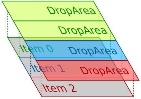
Each DraggableItem contains a DropArea which is the same size as the DraggableItem and is positioned between its DraggableItem and the one next to it. This way when the user drops an item on a DropArea, we know we have to insert the dragged item after the item which owns the DropArea.
There is a special case though: we also want the user to be able to drop an item before the first item. To handle this, the first DraggableItem of the list is going to be special: it will have another DropArea, with its vertical center aligned to the top edge of the DraggableItem.
This diagram should make it clearer:

As you can see, "Item 0" has two DropArea, whereas the other items only have one. Here is the code which adds the DropAreas:
Loader {
    id: topDropAreaLoader
    active: model.index === 0
    anchors {
        left: parent.left
        right: parent.right
        bottom: root.verticalCenter
    }
    height: contentItem.height
    sourceComponent: Component {
        DraggableItemDropArea {
            dropIndex: 0
        }
    }
}
DraggableItemDropArea {
    anchors {
        left: parent.left
        right: parent.right
        top: root.verticalCenter
    }
    height: contentItem.height
    dropIndex: model.index + 1
}
We use a Loader to create the special DropArea for the first item of the list. DraggableItemDropArea is just a DropArea with a dropIndex property and a Rectangle to show a drop indicator. Before showing its code, lets finish the code of DraggableItem. The only remaining part is the function responsible for emitting the moveItemRequested signal:
function emitMoveItemRequested() {
    var dropArea = contentItemWrapper.Drag.target;
    if (!dropArea) {
        return;
    }
    var dropIndex = dropArea.dropIndex;
    // If the target item is below us, then decrement dropIndex because the target item is
    // going to move up when our item leaves its place
    if (model.index < dropIndex) {
        dropIndex--;
    }
    if (model.index === dropIndex) {
        return;
    }
    root.moveItemRequested(model.index, dropIndex);
}
That's it for DraggableItem.
DraggableItemDropArea
Not much complexity here, we will actually remove this component later in the series. Here is the code:
import QtQuick 2.0
DropArea {
    id: root
    property int dropIndex
    Rectangle {
        id: dropIndicator
        anchors {
            left: parent.left
            right: parent.right
            top: dropIndex === 0 ? parent.verticalCenter : undefined
            bottom: dropIndex === 0 ? undefined : parent.verticalCenter
        }
        height: 2
        opacity: root.containsDrag ? 0.8 : 0.0
        color: "red"
    }
}
DraggableItemDropArea adds a dropIndex property and a Rectangle to draw the 2 pixel red line indicating where the item is going to be dropped, with a small hack to position the Rectangle correctly for the special case of the top DropArea of the first DraggableItem.
That's it for this first article in the series. You can find the source code in the associated GitHub repository, under the "1-base" tag. You can now continue to the next article of the series.
